Energieatlas Rheinland-Pfalz asked for a new website
2024
WEBSITE
UX & UI
My Impact

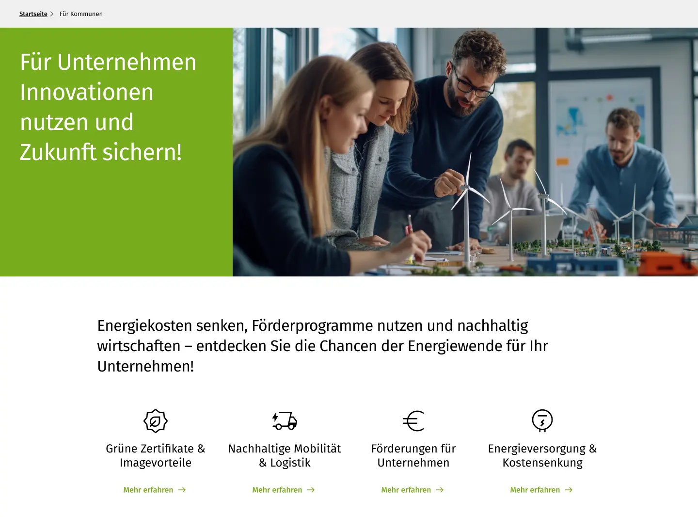
Together with UX-Designer  Justus Szabó, I designed a prototype for the website of Energiealtas Rheinland-Pfalz, that motivated the Customer to go one step further.
About ENERGIEATLAS RHEINLAND-PFALZ

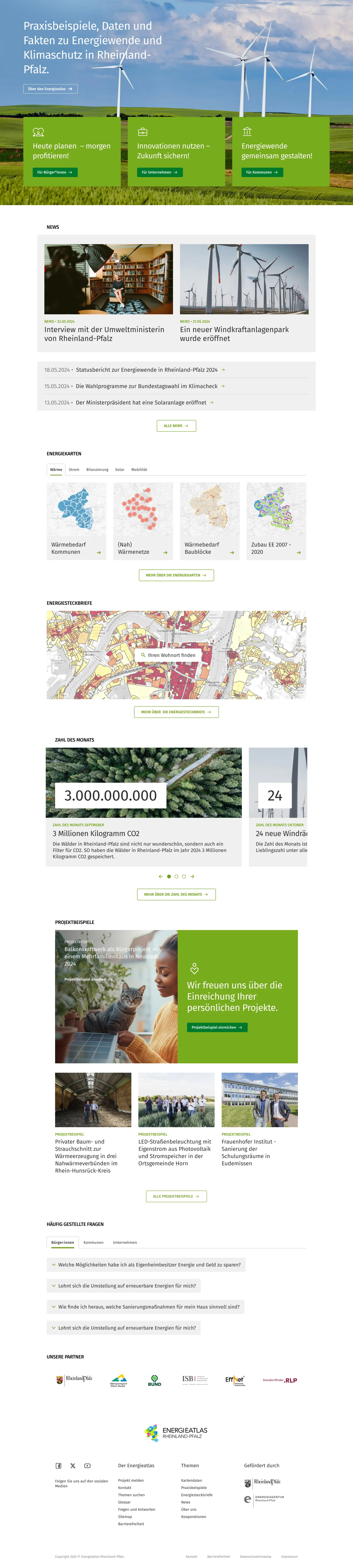
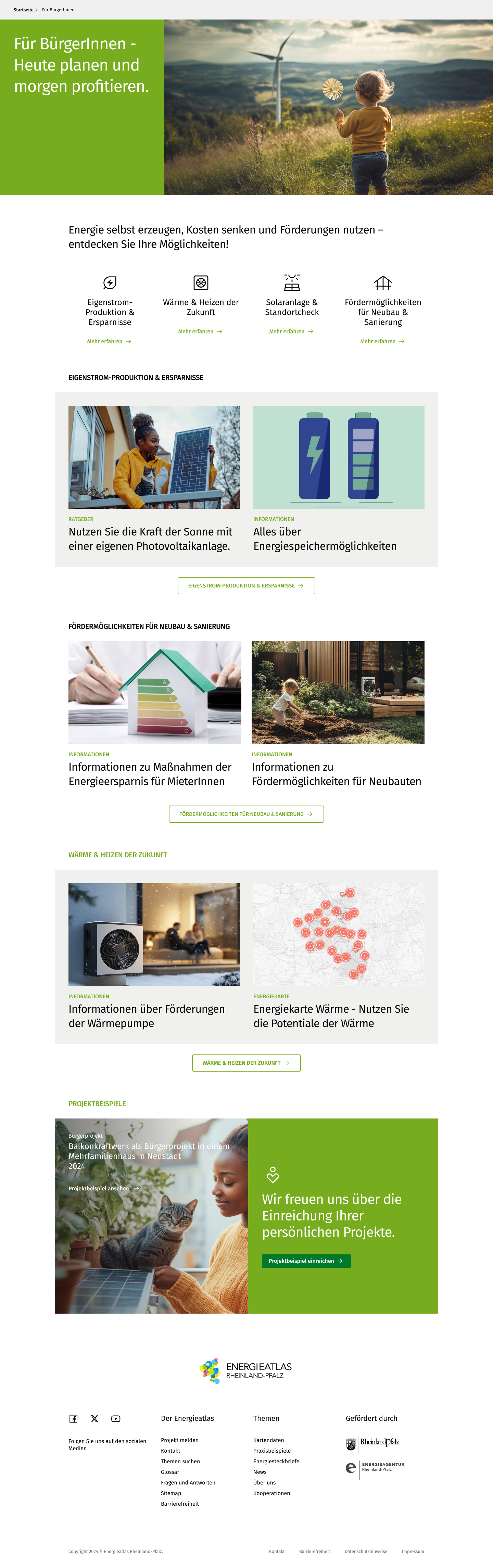
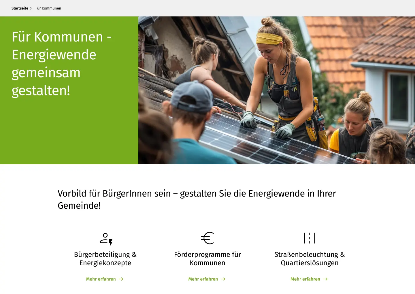
The Energieatlas Rheinland-Pfalz, by Energieagentur Rheinland-Pfalz, visualizes data and trends in the state’s energy transition. It focuses on electricity, heating, renewable energy, and sustainable mobility, while showcasing municipal climate actions and practical examples of energy-saving and efficiency projects.
Energieatlas Rheinland-Pfalz needed a website redesign. I worked with UX-Designer  Justus Szabó, a friend of mine who managed client communications.

Our contribution to the project was part of the initial phase: a user testing in which the design of a new website was compared to the old design.
Goal
Along with improved usability and navigation, the customer demanded entry points tailored to the three identified target groups.

The result was a clickable figma prototype that was tested in a user testing.
Solution
Scroll me
News & Announcements Prioritized – Positioned directly below for maximum visibility.

Energy Maps Clearly Structured – A dedicated section enhances usability.

Interactive 'Number of the Month' Carousel – Encourages user engagement.

Energy Certificates with Intuitive Search – A background map and input field guide users effortlessly.

Visually Highlighted Project Examples – A premium image draws attention

Logical Flow Until Page End – FAQs, partners, and footer ensure a smooth journey.
To improve accessibility, I placed a concise introduction at the top, followed by three clear entry points for citizens, businesses, and municipalities. This provides instant orientation and minimizes friction.
Scroll me
Quick Overview with Icons – Four key topics, tailored to the specific target group, provide a structured entry point to relevant information.

Well-Organized Content Blocks – Each section presents essential insights in a clear, digestible format, ensuring accessibility and ease of understanding.

Seamless Navigation to Further Resources – A prominent call-to-action button guides users to more in-depth information and relevant tools.
To ensure a seamless user experience, I incorporated AI-generated visuals that create a strong first impression. The header carries over the key message from the homepage, providing users with immediate orientation.
The same structured approach has been applied to the pages for municipalities and businesses, ensuring clarity, accessibility, and an intuitive user experience across all target groups.
Final Output
The user testing went very well and the customer was satisfied with the results delivered. The new entry points for the three user groups were exactly what the customer asked for.

In addition, the images generated with AI, which were very well received during the user testing, were very well received. the customer subsequently wanted more AI images to ensure that this inspiration could be used to create a visual world for the energy atlas in the future.
Email →
Instagram →
IMPRESSUM →
Twitter →
Tim-Hendrik von Wittke
UX & UI Designer

Gotzkowskystraße 16
10555 Berlin

Kontakt
Telefon: 015770421652
E-Mail: tim_wittke@web.de

EU-Streitschlichtung
Die Europäische Kommission stellt eine Plattform zur Online-Streitbeilegung (OS) bereit:
https://ec.europa.eu/consumers/odr/.

Unsere E-Mail-Adresse finden Sie oben im Impressum.


Verbraucherstreitbeilegung/Universalschlichtungsstelle
Wir sind nicht bereit oder verpflichtet, an Streitbeilegungsverfahren vor einer
Verbraucherschlichtungsstelle teilzunehmen.


Quelle:
eRecht24